
These screens are fully interactive—tap through the prototype to explore key flows, transitions, and real app behaviors.
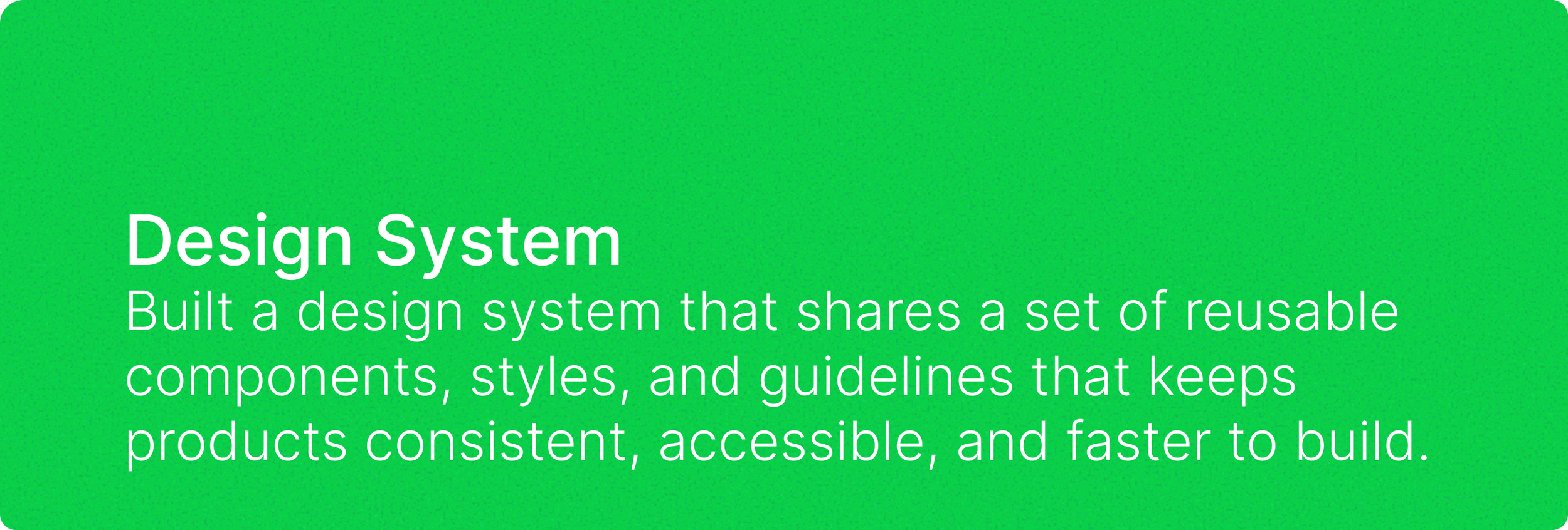
We created a comprehensive Transamerica design system featuring seven sections: Colors (brand palette with reds and blues), Typography (heading and body text styles), Buttons (primary, secondary, outline, ghost, and icon variants), Forms (inputs, selects, checkboxes, validation states), Cards (account cards, alerts, basic cards), Icons (financial icons in various sizes), and Layouts (dashboard and form examples). This interactive showcase demonstrates all the reusable components and design patterns for building Transamerica financial applications.
Role
Ui/UX Designer